Cloned Self Portraits: How I Do It
I have been asked by several online friends how I create the photos of multiple me’s such as this one below, so here is a tutorial. This is my Christmas card 2010.
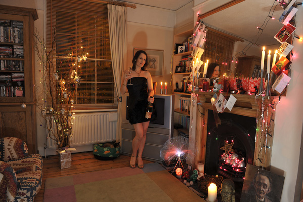
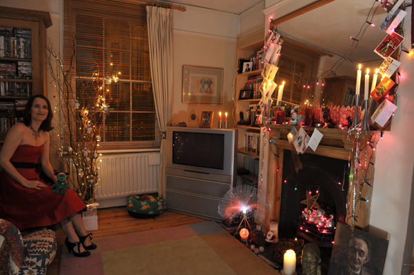
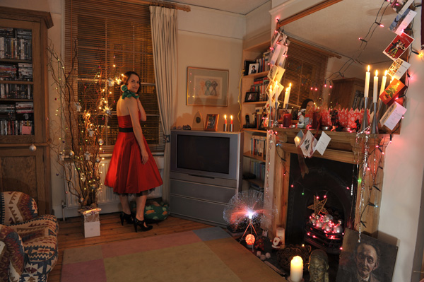
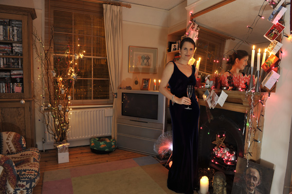
I set up the tripod in the corner of the room and composed the shot, ensuring that all the places I planned to be were in the frame. Had to take a couple of test shots to be sure of this, followed by the off-camera flash until I got the look I was after (warm, glowing and festive), before settling on ISO 400, 24mm, 0.4s at f5.6. Can’t remember the flash settings and these are not recorded in the EXIF data – sorry! There then followed lots of changing of clothes and backwards and fowardsing as I took the following five shots (that’s my cat Jasper asleep in his little green nest by the radiator – as you can see he was remarkably un-interested in the entire process):
#1
#2
#3
#4
#5
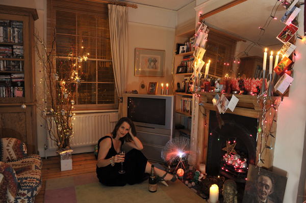
I then opened each of the above images in Photoshop, with #1 as the master, and copied and pasted numbers 2-5 as separate layers over #1. Using the Lasso Tool I roughly selected myself from one of the other photograph layers, chose Select>Inverse from the top menu followed by the delete on the keyboard to clear the rest of the photo layer so that all was left was the roughly selected me:
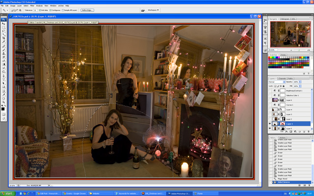
After I had applied the same treatment to the other three photographs it looked something like this:
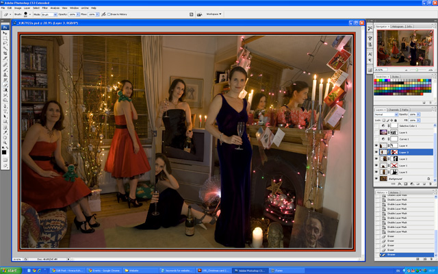
For each layer apart from the background I then selected Layer>Layer Mask>Reveal All from the top menu to create a layer mask for each separate ‘me’ layer, and then closed all but one of these layers to make it easier to work. I selected the Brush Tool set to soft/round 300px (the size of the brush can be quickly adjusted on the keyboard using the square brackets [ ] – a handy tip!), and ensuring that the Foreground Colour was set to black and that I had the Layer Mask Thumbnail selected, I began to ‘paint out’ the areas around each figure which were overlapping and hiding the others, and thus the figure standing behind the sitting one appears like magic:
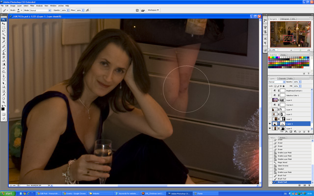
Where there was a lot of overlap I had to zoom in really close and use a much smaller brush to paint around the edges of the figure in front of the other one. It’s advisable to use a soft brush as this is much more forgiving and makes it easier to make a subtle blend, and lowering the Opacity from 100% (anything down to 10%) also helps a lot with this. You will probably have to zoom in even closer than I have shown here for any really intricate bits. The key is not to have any light or dark haloes where the figures overlap. It can be fiddly but it’s worth spending the time on it for excellent results.
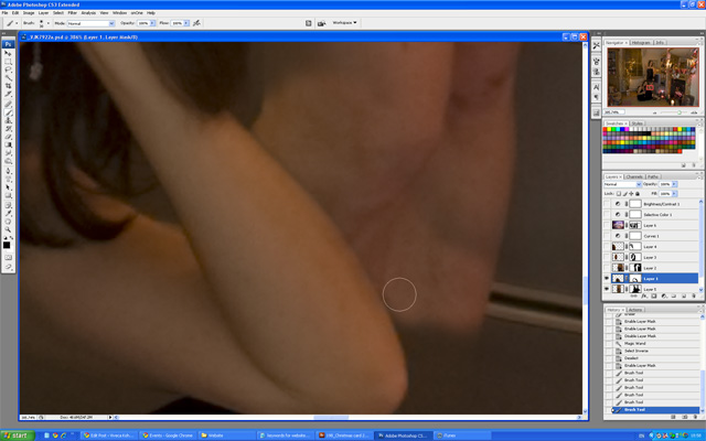
The great thing about using layer masks instead of the Eraser Tool to remove what’s not needed is that if a mistake is made you can simply change the foreground colour to white and ‘paint’ the relevant area back in. After I had applied this treatment to all the layers, I added a Layer>New Adjustment Layer>Levels to boost the contrast slightly, so that it looked like this:
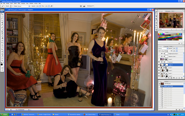
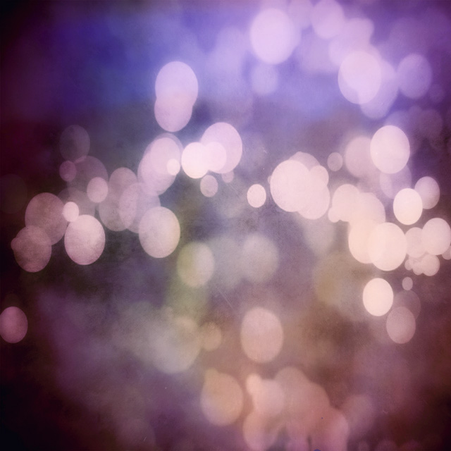
However, the image was still a bit bright and there were too many distracting elements on display in the room, such as my DVD collection and the unavoidable patch of white wall on the right hand side, so I selected from my textures database this one from Jerry Jones (a.k.a. Skeletalmess on Flickr), pasted it in as a new layer above all the others and used Edit>Transform>Scale to stretch it across the entire image.
I then added a Layer Mask to the texture layer and using the soft fat black Brush Tool painted out where I didn’t want to texture to be, as it had made the image look like this:
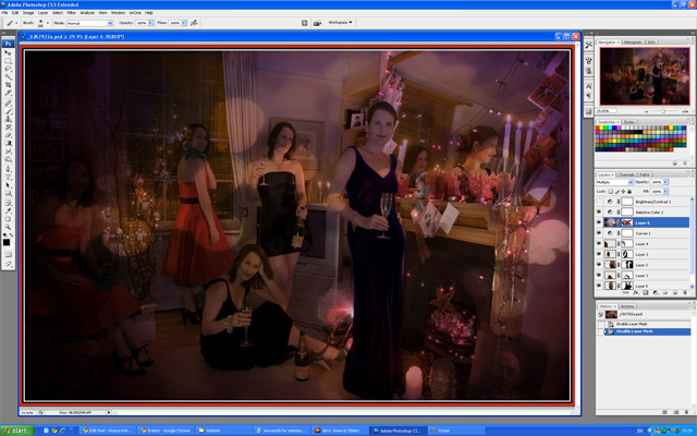
Finally, on top of all this, I added a Layer>New Adjustment Layer>Brightness/Contrast layer set to +41, as the image was still a tad dark, and the end result was the photograph shown at the top of this post!

No comments:
Post a Comment