Thursday, December 13, 2012

BOKEH for landscaper


BOKEH for landscaper
by Christopher O'donnell
You may have heard other photographers speak of “bokeh” when discussing the depth of field in their images. If you haven’t, then this article will be especially beneficial to you. Many photographers use their aperture to isolate their main subject (if you’re not sure what it means to use your aperture, this article here will help explain things). The desirable benefit of this is creating a stunning image with a soft, abstract-like background and/or foreground, as seen in the photo below.
A field of dandilions captured with a Canon 24mm f1.4 at sunset - very shallow depth of field.
This photo was taken at f/1.4, which gave a soft and dream-like background to this dandelion.

Before I get into the specific techniques on how to capture an image like this, I want you all to have clear idea of what exactly bokeh is.
Bokeh is not just having a shallow depth of field – or a blurred background/foreground – it is the quality of the blur. While the interpretation of what constitutes “good” and “bad” bokeh depends on your own personal preference, there is a general understanding that an image with good bokeh is one that has a lot of variations in shapes, color, and texture – such as the image below.
Dandilions on a hill overlooking the Merriconeag Bay from Bailey Island.

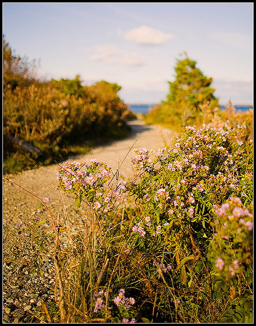
This image was shot with a telephoto lens in order to compress the distances between the foreground (the hill), the middle ground (the yellow daisies) and the background. As you can see I’m sticking with a dandelion theme.
While a shallow depth of field was used here, the bokeh is very smooth in the blurred background (the sky, horizon line, and water). Instead, the more defined, coarse bokeh here is the shapes and colors created by the out-of-focus dandelions in the immediate foreground, and the yellow daisies and small tree present in the middle ground. Rather than being in perfect focus, they create beautiful overlapping shapes.
So a photograph that has a very flat blur or is just simply out of focus (like the background water and sky in the above image) is not something you would generally consider to have good bokeh.
Identifying an image with strong bokeh will come easier with practice and you’ll soon develop your own personal taste. For now, let’s focus on how to actually take an image with bokeh.

Having beautiful bokeh in your photo is much more than shooting with a wide aperture – there is a recipe for it.
Besides widening your aperture (also referred to as “opening up your lens” or “stopping down all the way”), the distance between you and your subject and your subject to your background greatly affects the amount of blur you have in your image – thus determining the quality of your bokeh.
For example, if you’re using a regular portrait lens – say a 50mm prime – to capture an image of your friend, you’ll notice some considerable differences in your bokeh depending on the distance between your friend and their background. If you were to place them in the middle of a field with the closest background object – say a line of trees – about 100 ft. away, you’ll be able to capture a very blurry background.
In contrast, if you were to place your friend right in front of the tree with only a foot or so between them and the background, you’ll have little to no background blur. For successful bokeh, you will need to have some space in between your subject and your background. The exact distance of the space needed greatly depends on your focal length, the distance between your camera and your subject, and of course the aperture you’re using. The only way to know the exact distances for good bokeh is through practice and experience.
The same goes for the distance between you (meaning the camera) and your subject, only reversed – the closer you are to your subject, the more profound your background blur and bokeh will become. Let’s use the same example of you and your friend again. Instead of focusing on how much distance is between your model and the background, open up your lens all the way and gradually approach them, making sure to take photos along the way. When comparing your photos you’ll notice that your background will become more and more blurry – or develops a more shallow depth of field – when you approach your model.
This is why wide angle lenses work so well in landscape photography – especially ones that have wide apertures. The ability to get very close to your subject while still capturing much of your surroundings can create a dramatic and stunning perspective:
A dirt lane covered in fallen leaves leading to a small graveyard. This photo was taken in the fall in Harpswell, Maine.
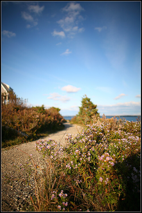
The immediate foreground of this image was only a few inches away from the camera lens, yet I was still able to capture a large amount of my surroundings. Not only did this wide angle lens allow me to capture a wide area, but it gave me stellar bokeh since I was so close to my focal point (the leaves in the foreground).


It’s important to be able to balance your aperture with the distance between your subject and the background since it’s possible for you to go too shallow with your depth of field which will actually smooth out any defined bokeh shapes you may have had.
For example, let’s look at the first image of the dandelion again.
A field of dandilions captured with a Canon 24mm f1.4 at sunset - very shallow depth of field.
You’ll notice that the foreground has some identifiable bokeh around the grass and flowers, but the background is blurred to the point where defined bokeh shapes is non-existent. Instead, it’s a blanket of blur because the image was shot at f/1.4 – which, for this particular image, is an aperture wide enough to smooth out any shapes in the distant tree line and sky. In other words, my focal point is too far away from the background at this aperture to create any well-defined bokeh.


While the soft background works particularly well in this image, it may not be something you’d want for others. A smaller aperture would have produced more bokeh in the background, but the dandelion in the foreground would not have been as isolated. You’ll often encounter these delicate balances when shooting so it is inevitably up to you and how you want to create your photo.
So to summarize, the two biggest factors in controlling your depth of field (besides, of course, your aperture) are:
1. The distance between YOUR SUBJECT and the BACKGROUND
and
2. The distance between YOUR CAMERA and YOUR SUBJECT

However, your distances are only part of the puzzle. The steps above simply help you to adjust your distances as necessary in order to get the right depth of field to create bokeh – you still need a source of bokeh. You can have a very shallow depth of field and still have no bokeh depending on what your background (or foreground) consists of.
The quality of your bokeh has everything to do with what elements are in your image. The wonderful shapes and patterns created by your lens are made from points of light that are then transformed into bokeh. These points of light could be a variety of things – reflection in the water, light coming through leaves in a tree, or even a bright light reflected on a surface.
Let’s look at some bokeh examples that illustrate my point here:
The local pier in Friendship, Maine - fishing boats as seen from the town landing at sunset.
While there are no direct sources of light in this image, the sun is reflecting on the side of the boats. This reflection created the great bokeh shapes you see. Notice how the bokeh is only on the side of the boats that have the sun’s reflection while no bokeh is present on the shadow side.
A lone mushroom growing in the forests of Georgetown, Maine.
The bokeh in this photo is a bit different. The bokeh here is created from the direct sunlight coming through the leaves and also hitting the ground. This combination of bright bokeh with the darkened environment of the forest is a striking contrast.

Fire weed captured during a foggy spring day in coastal Maine.
The final image shows that no matter what depth of field you use, you can’t create bokeh without a point of light. I took this photo on an overcast day, which means no reflections and no sources of light. Although I shot this at f/1.8, there is no bokeh present anywhere in this photo. I enjoy the stark mood created by the smoothness of my blur, but if you’re looking for bokeh then you need to follow the light.


To create a great, bokeh-filled image, you have to first get in the right position to create it by adjusting the distances between you and your subject, and your subject to your background. When you have that technique down, you can then judge the quality of your bokeh before ever taking your photo just by seeking out strong light points in your image.
Remember: a great photograph does not have to have bokeh in it. However, it’s a unique phenomenon in photography that you can fun with

Four Simple Ways to Improve Your Landscape Photos in Photoshop


Four Simple Ways to Improve Your Landscape Photos in Photoshop


All true landscape photographers take pride in their work, and that pride usually comes from hours of Photoshop editing. While there are numerous guides, tricks, and hints you can follow to edit your landscape photos beautifully, most take some time and dedication to perfect. Before you delve into the unforeseen, and sometimes complicated, world of Photoshop editing, consider the following simple techniques that are the foundation of impressive landscape photographs.
Improve Your Landscape Photos in Photoshop

1. Straighten Your Horizon

Presenting the most stunning photo of a sunset on the Venice canal won’t mean much if your horizon is crooked; it’s quite off-putting. To easily correct this in Photoshop, open your image and click View > Show > Grid to bring up some grid lines that you can use to guide your horizon line. With your transform tool (CTRL + T), rotate the image until your horizon is lined up correctly (Figure 1). To finish, crop out the uneven edges and press CTRL + H to put the grid away.
Improve Your Landscape Photos in Photoshop

2. Make Your Horizon Off-Center

To be ascetically pleasing, a horizon that is not centered is much more intriguing to the eye and should be utilized whenever possible. In the example image, the horizon – although now straight – is too close to the center of the image. To rectify this, I am going to use my crop tool (keyboard shortcut: C) and eliminate at least half of the sky so that the balance of the photo is on the bottom, not the top (Figure 2).
Improve Your Landscape Photos in Photoshop

3. Rule of Thirds

When looking at a photo, there are certain guidelines to follow composition-wise. One guide is called the “rule of thirds”, where you should visualize your photo as having two vertical and horizontal lines dividing the photo into thirds (imagine a tic-tac-toe board). The horizon (or other important line in your photo) should be along one of the horizontal lines, while other focal points should either lie along any of the lines or the point where they intersect (Figure 3). This creates an image that is more visually stimulating to the eye and allows it to wander across the whole image. If your photo has a focal point planted in the center of the frame, then the eyes will be drawn directly to the center and may not see a need to explore the other elements in your composition.
Improve Your Landscape Photos in Photoshop
While ideally you should apply this rule out in the field rather than in post process, us photographers do not always have the time – or patience – to consider this, and rely on programs like Photoshop to line our images up correctly.
Looking at Figure 3, you can see that in the example image a major focal point (the tree in the top-right circle) is lined up perfectly with one of the intersection points. However, the horizon seems to be a bit low under the top horizontal line. To correct this, I’m going to crop out a bit more sky, and also crop out that distracting shadow in the bottom right-hand corner of the image.

4. Photo Filters

Film photographers – and some digital ones as well – use photo filters when out in the field to cast special coloring effects over their images. Warming filters will cast a slight orange/yellow hue to your image, while cooling filters will give your photo a blue hue. These are just a small sample of countless other filters you can use to add special effects to your photos. In Photoshop, however, you can easily add these effects with little effort.
To add a Photo Filter adjustment layer to your image, click on the “new adjustment layer” icon on your layers palette toolbar, or simply click on the appropriate icon on your adjustment palette (Figure 4).
Improve Your Landscape Photos in Photoshop
5. While the example image is coming together nicely, the blue sky could use a nice warming filter. I chose “Warming Filter (85)” as my filter choice and set the Density to 25 (Figure 5). I deselected the “preserve luminosity” box since the warming filter was starting to create some blown highlights.
Improve Your Landscape Photos in Photoshop
When compared to our original image, the improvement is quite apparent.
Improve Your Landscape Photos in Photoshop
While this image isn’t even close to being at the end of my editing process, it has benefited greatly from a few simple visual enhancements that only took a total of ten minutes to complete. If you incorporate this tutorial into your workflow, it will provide your landscape images with a very solid foundation to begin applying your editing techniques to.

How to Turn Your Favorite Photo into a Miniature Masterpiece


How to Turn Your Favorite Photo into a Miniature Masterpiece

After looking at all the amazing tilt-shift images from our previous post, I’m sure you are ready to create some of your own. It’s really very simple to do. It can be accomplished in just a few easy steps. I am using Photoshop to create this tutorial but I’m sure it can be adapted for other photo applications. Lets get started.
First you want to select a photo that will work for this technique. You want to use a photo that has the perspective of looking down on the subject matter. This will make the effect more believable.
Here is an image I will be working with from Dr. Antonio Comia via Flickr. Please check out other images from this talented photographer.
Original Image
Ok, lets get started. First open up your image in Photoshop. Once open, select the Quick Mask Mode from your toolbar or hit Q.
Toolbar Image 1
Next, with the Quick Mask Mode selected click on the Gradient Tool or hit G.
Toolbar Image 2
Select the Reflected Gradient Button and make sure your gradient runs from black to white as shown.
mode and gradient image
Draw a vertical line from the center of the area you want in focus to the point where you want the blur to start. It will probably take a few times to get it the way you want.
mask image
Next step is to go back into Standard Mask Mode by clicking the Quick Mask Mode again or hitting Q. Note: These are instructions for Photoshop CS4. CS3 has a separate button for Standard Mask Mode.
Once in Standard Mask Mode we are going to apply a Lens Blur to the image. Go to Filter>Blur>Lens Blur.
filter path image
Now it’s time to experiment with the Lens Blur setting to get what you want. When you are satisfied hit OK.
Lens Blur Dialog image
To take it a step further and give your image more of a plastic look, play around with the saturation and contrast of the image. Here is my final image after some tweaking to the saturation and contrast.
Final image
That was easy wasn’t it! Just a few steps for a very cool effect. Have fun making your own miniature scenes!

Master Realistic Eye Editing in Photoshop


Master Realistic Eye Editing in Photoshop


Whether your model has that early-morning blur to their eyes or your shooting conditions were less than optimal, almost every portrait could benefit from bit of Photoshop eye assistance. By following these steps, you can achieve clear, vibrant, and piercing eyes all within fifteen minutes of post process work.
1. Click Layers > Duplicate Layer, then apply a layer mask by clicking on the icon on your layers palette toolbar (Figure 1). Select the Clone Stamp tool, and with a steady hand, clone out any unwanted or distracting reflections (unless you think they add to the portrait in some way). You may need to increase the brush hardness of your clone stamp (right-clicking on the photo will bring up the appropriate menu) when working along sharper edges, such as the pupil or the eyelids. It would also be good to clone out any redness in the whites of the eyes as well.
Eye Editing in Photoshop
The layer mask is useful in case you over-do it with your cloning: for example, if you clone with too soft of a brush on the whites of the eyes and need to mask in the eyelids a bit.
2. When finished, if you did not use your layer mask, just delete it by right-clicking the mask and selecting Delete Layer Mask.
If you did use it, then you will need to merge down a layer so that our new effects will be applied to a layer with 100% uniform transparency. To do this, click on your base layer and duplicate it. The duplicate layer should appear right beneath the top layer (the one you just masked). Now right-click on the top layer and select Merge Down to combine both layers into one.
3. Let’s create a new level adjustment layer by clicking on the Levels icon in your Adjustment palette (Figure 2). Alternatively, you can select a Level Adjustment layer from the layers palette toolbar.
Eye Editing in Photoshop
In the Adjustment palette, slide your levels around to lighten the white colors and darken the darker ones. Usually, you will only want to increase the black point triangle by very little since the outlines of the eyelids as well as the pupils are already very dark. However, the white point triangle should be adjusted rather liberally, and the midtone point slider pushed slightly whiter by sliding it to the left. For this example, the black point was reset to 9, midpoint reset to 1.30, and the white point to 225 (Figure 3).
Eye Editing in Photoshop
Do not care about what this adjustment does to the entire photo, just focus on the eyes. We will be masking out the level effect on the entire image shortly.
4. Click on the layer mask for the level adjustment layer that was automatically added and delete it by right-clicking and selecting Delete Layer Mask. You can also delete it quickly by clicking on the layer mask and drag-and-dropping it into the trash can located on your layers palette toolbar.
While holding down the ALT key, click on the Add Layer Mask button on your layers palette toolbar to add a black layer mask, which will hide the effect and allow us to only mask in what we choose (Figure 4).
Eye Editing in Photoshop
5. Click on your brush tool and set your opacity to 40% and the Master Diameter large enough to cover the entire eye. Make sure your hardness is set to 0% so that we have a very soft brush. In one circular motion, mask in the entire eye AND the entire area around the eye (about one brush width outwards from the eyelids) so that we eliminate some unwanted shadows. With the same brush, this time mask only the eye and eyelids, and finally with a smaller brush, mask just the inner eye area. Our goal is to create a gradual and flattering brightening effect around the eye that increases in intensity as you move towards to the pupil area. The finished result should look something similar to Figure 5.
Eye Editing in Photoshop
6. To finish, we are going to liven up the eye color a bit. Click on your base layer (the first layer under the adjustment layer) and then select your Oval Marquee tool, making sure the “add to selection” option is selected from the top toolbar (Figure 6). Select the entire iris area, adding to the small circles you create so that the selection is accurate. When finished, switch to the “subtract from selection” option, located just to the right of the “add to selection” option, and subtract the dark pupil area.
Eye Editing in Photoshop
7. To finish the selection, click on the Refine Edge button on your top toolbar and adjust the feathering so that the edges of your selection are gradual and soft. Click OK when finished (Figure 7).
Eye Editing in Photoshop
8. Add a new Hue/Saturation adjustment layer, which should automatically provide you with a layer mask that only affects the area we just selected. Increase Saturation to about 50%, or whatever you consider to look natural and vibrant (Figure 8).
Eye Editing in Photoshop
As an optional edit, you can select your Burn tool and with a very soft brush set at an opacity of about 8%, burn the eyeliner and eyelid area slightly to add a smokey eyeshadow effect.
Eye editing is certainly not limited to just red-eye removal, and by using the tools provided in this tutorial, you can be ready for any imperfection the camera decides to throw your way!

5 ways to use less salt


Sodium chloride (salt) is essential to the body. The sodium in salt helps transmit nerve impulses and contract muscle fibers. Working with potassium, it balances fluid levels in in the body. But you only need a tiny amount of salt to do this, less than one-tenth of a teaspoon. The average American gets nearly 20 times that much.
The body can generally rid itself of excess sodium. In some people, though, consuming extra sodium makes the body hold onto water. This increases the amount of fluid flowing through blood vessels, which can increase blood pressure.

Most of the salt that Americans consume comes from prepared and processed foods. The leading culprits include snack foods, sandwich meats, smoked and cured meat, canned juices, canned and dry soups, pizza and other fast foods, and many condiments, relishes, and sauces — for starters. But enough comes from the salt shaker that it’s worth finding alternatives. Here are 5 ways to cut back on sodium when cooking or at the table:
  1. Use spices and other flavor enhancers. Add flavor to your favorite dishes with spices, dried and fresh herbs, roots (such as garlic and ginger), citrus, vinegars, and wine. From black pepper, cinnamon, and turmeric to fresh basil, chili peppers, and lemon juice, these flavor enhancers create excitement for the palate — and with less sodium.
  2. Go nuts for healthy fats in the kitchen. Using the right healthy fats — from roasted nuts and avocados to olive, canola, soybean, and other oils — can add a rich flavor to foods, minus the salt.
  3. Sear, sauté, and roast. Searing and sautéing foods in a pan builds flavor. Roasting brings out the natural sweetness of many vegetables and the taste of fish and chicken. If you do steam or microwave food, perk up these dishes with a finishing drizzle of flavorful oil and a squeeze of citrus.
  4. Get your whole grains from sources other than bread. Even whole-grain bread, while a healthier choice than white, can contain considerable sodium. And bread contains salt, not just for flavor but to ensure that the dough rises properly. You can skip that extra salt when you use whole grains outside of baking. Try a Mediterranean-inspired whole-grain salad with chopped vegetables, nuts, and legumes, perhaps a small amount of cheese, herbs and spices, and healthy oils and vinegar or citrus. For breakfast, cook up steel-cut oats, farro, or other intact whole grains with fresh or dried fruit, and you can skip the toast (and the extra sodium).
  5. Know your seasons, and, even better, your local farmer. Shop for raw ingredients with maximum natural flavor, thereby avoiding the need to add as much (if any) sodium. Shop for peak-of-season produce from farmers’ markets and your local supermarket.

Tuesday, December 4, 2012

Food Photography: 5 Simple Ways to Get a Stronger Shot


Food Photography: 5 Simple Ways to Get a Stronger Shot

Images by BananaGranola and SuperDewa.

1. Colour Values

Hinamatsuri sushiPart of the attraction of food is the way it looks, so making sure your images exude the correct colours associated with the product. Before you begin shooting always take a white balance reading from a grey card if you have one or if you’re using a compact set the White Balance to a preset that matches the lighting environment 
you are shooting in.


2. Look for the Best Light

The best light for shooting food is soft and even, which is why a lot of it is shot in studios with large softboxes. But if don’t have expensive studio equipment to hand, position food in front of a clean window for the same effect, or if it’s a particularly bright day and you are getting shadows on your captures, veil the window with a white sheet or net to diffuse the rays or simply move the food further from the light source to diffuse its brightness. Alternatively if the weather is fair, consider pitching
up outside and shooting alfresco to add another element of interest to the frame.


3. Background

If you’re using a plate or work surface as the backdrop for your shoot, make sure it’s clean, tidy and no smudges of food plague the periphery. After shooting your first shot, zoom in during playback to be sure you haven’t missed anything that will result in hours of Photoshop cloning post-shoot. The backdrop and setting you use can ultimately enhance the message you want to achieve, so use this to compliment the food rather than detract from it; for example a wooden chopping board suggests rustic, an outdoor table says al fresco, square plates suggest minimalism, etc. Typically white backdrops carry connotations of image stock sites, so don’t be afraid 
to inject colour into the background using coloured sheets or card if item is small enough, for an added element of interest. When choosing the backdrop use a colour that compliments that of the food or reflects the vibe you want to portray, as darker colours can often influence thoughts of comfort and warmth, whereas lighter, brighter colours dictate ideas of freshness and frivolity.


Soba fusilli


4. Composition

Consider what makes the food look appealing and find a way to sell that feature. A wide aperture works well on products that are presented in rows or clusters and are easily identifiable such as; cupcakes, biscuits, and sweets etc.  If the product is small and plentiful, such as coffee beans or nuts for instance, consider cropping in close to fill the entire frame. Also consider your angle to add interest and sense of depth, scale and perspective. Make the most of interesting patterns and shapes by highlighting this as the focus. Including props to present the product can work well to convey a sense of scale or action, such as ladles, bowls, scales, pestle and mortar, or for drinks consider decorating the glass or backdrop with the fruit or flavours used in the ingredients.

Lunch


5. Action

As well as photographing the finished article there is a lot to be said for in-progress recipe shots that show food actually being prepared. Consider shots that feature motion such as chopping, blending, frying, rising in the oven etc and using a longer exposure to convey the sense of motion and speed. But don’t forget the tripod!

336/365: preparations

Studio Lighting: Building a Light Set-up


Studio Lighting: Building a Light Set-up

57Studio flash photography often appears to be complicated and confusing for the new photographer.  The tangled, twisted mess of light size, power, angle, position, direction, etc… can be daunting to say the least.  Not to mention the need for extra equipment such as backdrops, light stands, modifiers, reflectors and the lights themselves. Wow! Already seems like too much huh? You might find yourself thinking, “I can just use the giant light source in the sky that is available everyday and be done with all this other mangled mess of an armamentarium.”  At times I would not disagree with you, as the natural light from the sun is hard to beat and is in great abundance, however, when I look at how much my understanding of light and shadow has improved from my many unsuccessful studio lighting shoots, the value of learning this sort of lighting is tremendous. And yes I did say “unsuccessful shoots!”
Strangely enough, when I got started with photography, studio lighting was one of the areas in which I was most interested. Not the easiest place to start I can assure you, but  it definitely does not need to be as awkwardly bemusing as it first appears. Now this article is not meant to be a full on detailed description of what lights or modifiers to buy or an in depth scientific analysis of the inverse square law complete with physics equations and Einstein like theorems.  It is more of a reason of why to get started with studio lighting and to break through any mental barriers that might be in your way.  I promise you, once you get your feet a little wet and wild in the studio, you will not only love it, but also find that you have a better eye for light even when you are out at the wee hours of the morning trying to capture that perfectly beautiful sunrise.
To shoot my studio work, I use simple, durable yet economically feasible equipment.  I currently use a set of Alien Bees strobes from Paul C. Buff. There are a lot of other brands of strobes out there, but these have worked well for me and fit within my budget.  Now, you do not necessarily need to use strobes. Westcott has their Spiderlite TD continuous lighting system that also could suffice. Basically any system of lighting can work fine. You could use a couple of lamps with a shower curtain liner to diffuse the light if you want. Don’t get too hung up on the equipment at first, but try to understand how to position and control the lighting to get the desired results.  I am trying not to get pulled into a discussion about equipment, but admittedly some equipment is required. In order to move on, I would recommend getting a good book or two on studio lighting to give you a thorough description of some lighting basics. Two that I have personally found useful are Master Lighting Guide for Portrait Photographersby Christopher Grey or Basic Studio Lighting: The Photographer’s Complete Guide to Professional Techniques, by Tony Corbell. There was also a nice post here on DPS recently called One Light Portraits: Simple Elegance, by Rick Berk.
Whew! Let’s move on and get into some of the nitty gritty of setting up a studio portrait shoot. Lately, I have been working on some creatively themed portrait shoots as a personal project.  The basics of what you need for a shoot are simple. You need a background and a willing model or subject. This can be a plain wall in your house and a close friend or even some fabric taped to the wall with a bowl of fruit on a table in front of it. My theme was fire, so first I went to the fabric store and found an interesting black/grey charred looking swath. A quick aside, if you want to find some really cool backgrounds in the U.S. go to a fabric store around Halloween and they will have some really great stuff.  Next, I got a hold of a local model, the fabulous Brittney and set-up a time for the shoot. I also hired the amazing Dina Bree Nast a local make-up artist here in Denver, Colorado. I must say, and this is just my own opinion, but if you have never hired a make-up artist for a shoot, you have to try it as the results are spectacular and it will reduce your post-processing time tremendously.
Okay, the date, model, MUA and backdrop were set. Next and most importantly, how do I design the lighting set-up.  A little planning goes a long way with a studio shoot. When you are just getting started you do not want to have to deal with moving a lot of lights around or having your subject face the wrong way and have shadows in places where you do not want them. A sure fire way to avoid this is to first give your subject a stool or a chair to sit on. This will keep them in one place at the same distance and proximity from your lighting set-up and your background. Secondly, stick to one lighting set-up and limit the shoot to it. You want to focus on getting the shot that you want and not be constantly worried about fumbling with the lights. If you are more focused on the lights and everything else going on with the equipment, you will not pay attention to getting a great pose and expression and let’s be honest, the lighting can be less then perfect if you capture the right moment.  Finally, you would like to have an idea of what sort of depth of field at which you would like to shoot. If you want the background slightly blurred go with a wide open aperture of f/2.8-f/4. In my plan for this shot, I chose f/8 as I wanted to capture a bit of the look and texture in the background as I felt it complimented the shot. Additionally, I keep my ISO low which for my Nikon is 200 and my shutter speed I usually leave at 1/125 of a second. Thus, my camera settings are set already and I have not even taken a shot yet.


I always start my lighting set-up with the position and exposure setting of the main light or the one that will be responsible for lighting the subject.  In this shot, I already know I want my aperture around f/8 so that I can capture that background detail. This already let’s me know where I want my main lights exposure to be set. Now, there are two ways to set the main light’s exposure. You can use a light meter or you can wing it by taking some practice shots and checking your histogram and adjusting accordingly. Either way works well even though many people have opinions about one way or the other. Personally, I use a combination of both. So what about position of the light?

To start out with, I think using a glamour or butterfly lighting set-up (named for the shadow pattern created beneath the subjects nose) is very easy and is incredibly flattering for the subject. To achieve butterfly lighting the main light is set directly in front and slightly above the subject with the light angled down toward the subject. As a beginner, having the light directly in front of the subject is useful cause if the subject turns their head one way or the other they will still always be within the range of the main light. I used a 36-inch strip softbox in this set-up placed about 2-3 ft from the subject in the horizontal position to achieve a narrow, soft beam of light that would not spill onto the background very much. Then I took a few shots to see what it looks like.


As you can see with just the main light, the subject is adequately exposed, however, I cannot see the background and the subjects dark hair blends in so much with the background that you cannot see the outline of her hair. What does this tell me? I need to light the background as well as the hair to separate her from the background and gain some depth to the image. Since my theme was fire, I wanted to incorporate some colors that would support the theme. This made me think of reds, oranges and yellows. So to light the background I set a strobe just up off the floor angled up at the background with a standard reflector attached, however, I decided to place a red acetate gel over the light to give a little color to the background and support my theme. To set the power of this light I turned off my main light and took a few practice shots with only the background light on to see how it looked and adjusted the power of the light until I liked the look.


Here you can see with only the background light, I have a nice subtle red glow to the background that also brings out the interesting texture to compliment the fire theme of the shoot. The background light also wrapped around the subject just a little bit, likely bouncing a touch off the white surface of the softbox in front of her, giving a red tinge to the shadows. If I did not want this extra red in the image I could have moved my subject farther form the background, but I liked the effect so I left it alone.
Next, I needed to separate the subject’s  hair from the blending into the background.  I set up an additional light right behind the subject just below her shoulders and directed it with a standard reflector at the back of her head. I decided to add a yellow acetate gel over this light to hopefully give a bit of a fiery glow to the hair. Again I turned out the other lights and I took a few shots to see how it looked and adjusted it as needed.


As you can see, I now have a nice burning glow that highlights the outline of the hair and separates the subject form the background adding some depth to the image. I also get a little more of the yellow light reflecting of the strip softbox and filling in the shadows of the face with a bit of a golden tinge. When I looked back at the photo of the main light by itself I decided that this slight tinge would add some warmth into the shadow area and really compliment the photo. I have to admit this was a happy accident as a result of the light set-up.


Next, I took a few shots of just the background and hair light together to check how the two looked combined.
What do you think? A pretty nice combination that provided the shot with the fiery look I wanted, while also serving to bring out the background and help the subject stand out. To be critical, I was not pleased with the illumination of the subjects right ear, but I figured I could work with angles possibly to make it more subtle. Finally, I turned the main light back on and took a few more shots to see how all three lights looked together. I was very pleased with the result and felt that the little bit of red and yellow that spilled over into the shadows of the subjects face really helped to compliment the look and bring it all together.  At this point the light and camera settings were never touched and all I had to do was shoot and make sure I got the pose and expression I wanted, which when working with someone like the experienced Brittney was super easy. Is the light perfect? Definitely not, but it all comes together to produce a nice unique portrait.

I hope by going through my thought process step-by-step for this shot and by showing the effects of each light separately that it gives you a little insight into working with studio lighting and how you can construct an image one light at a time. Having total control of the lights is a bit scary, but once you start taking some baby steps with it, I promise you it will make all aspects of your photography better. Studio lighting is all about the direction and intensity of light and how it transitions and compliments into shadow. Wait, isn’t that what all photography is about? So go ahead and jump in head first. Inevitably, you will make a lot of mistakes, have many over and underexposed images, and end up with plenty of shots of which you are not proud, however, you will also absolutely get some fantastically, fascinating photos and learn a lot about the the interplay and visualization of light and shadows.  Plus, let’s be honest, don’t we have these same problems with any shoot? Any shot involves the light, background and subject and how we decide to capture and expose the image. Being able to control the light should actually make getting a great capture easier.