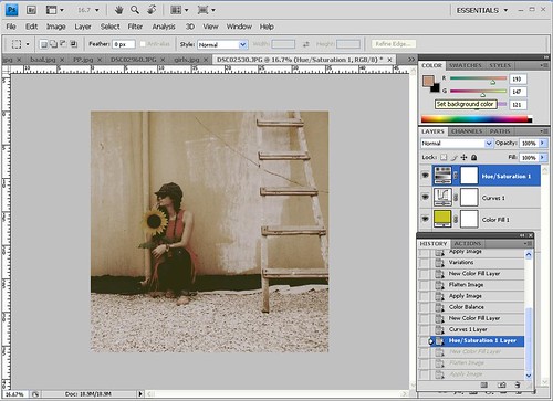
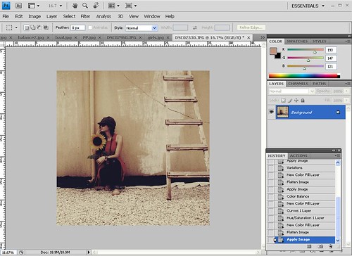
In photography vignetting, or light fall-off, is the loss of brightness at the borders of an image and it is a lens characteristic or weakness.
Usually vignettes are not desired however it is not uncommon to add them during post-processing for example to draw the attention of the user to a particular portion of the image or to give it an aged look.
I am going to show you how to add vignetting to your image using Adobephotoshop in just a few simple steps.
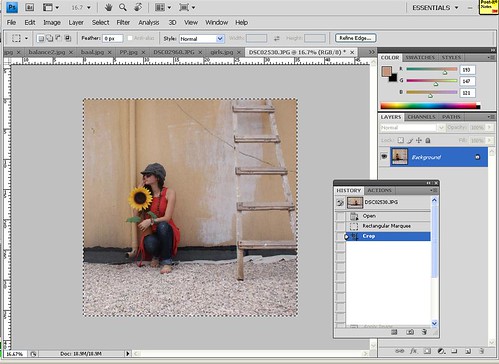
- Open the image you want to add vignettes to in Adobe Photoshop
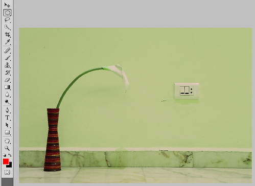
- Select the Lasso Tool (L) or the Elliptical Marquee tool (M)
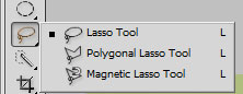
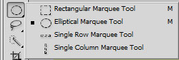
I usually prefer the Lasso Tool since it is more flexible and allow to draw irregular shapes. - Select loosely the portion of the image you want to draw attention to
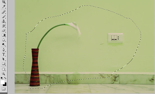
- Feather generously the selection
Right click inside the selection you’ve just made and click on Feather
In the Feather Radius box input a big number and press enter.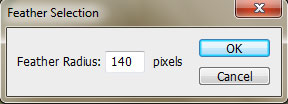
N.B.:Basically here you will have to experiment a bit to see which numberfits your picture but the general rule is that the higher the resolution the bigger the number.
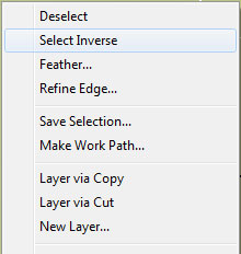
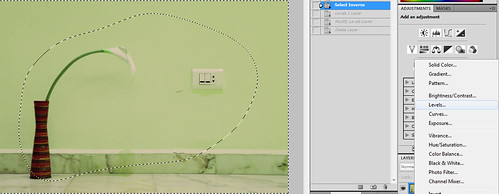
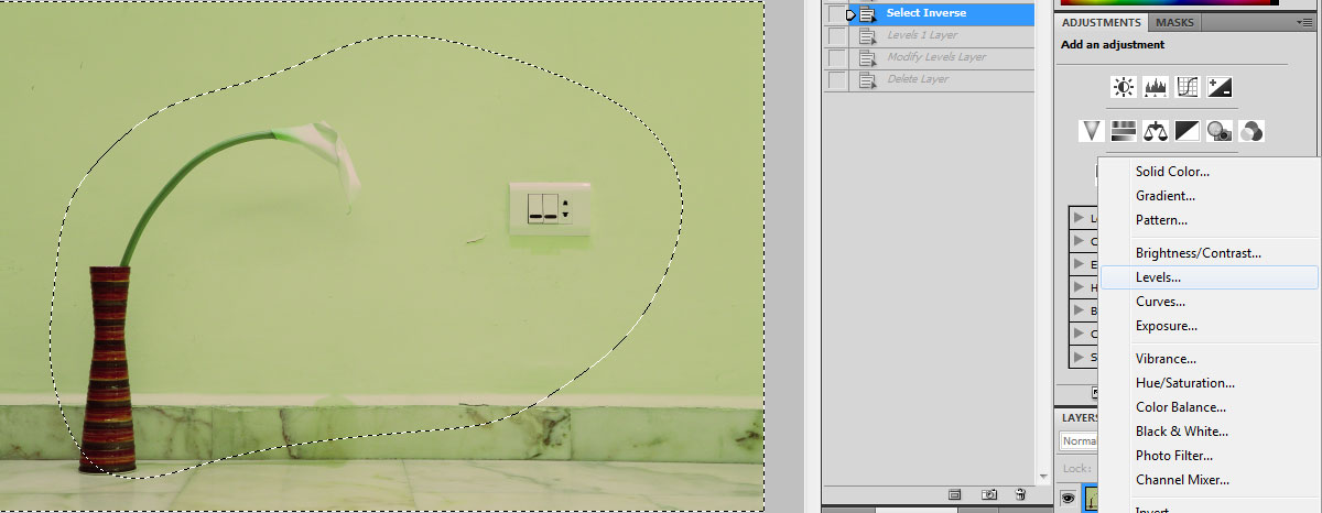
For a high-resolution picture start with 100 pixels - Inverse selection by right clicking inside the selection and click on “Select Inverse”
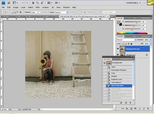
- Add a Levels layer (Click on image for higher resolution)
- Darken by pulling the central point to right till you are satisfied with the results (Click on image for higher resolution)
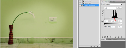
If the transition is not smooth enough to your liking go back to step 4 and pickup a higher number as Feather Radius
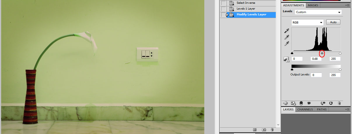
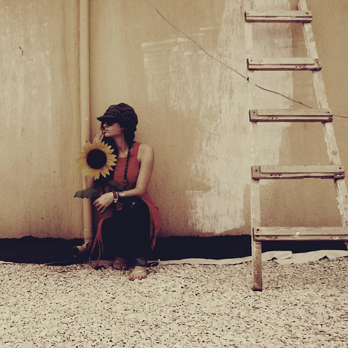
Final image