A Guest post by Mitchell Kanashkevich who is the author behind a brand new dPS eBook – Captivating Color.
Color is one facet of photography which we often tend to overlook and take for granted. It is frequently only considered after the photograph has already been taken.
Approaching color this way however is a big mistake and a lot of us make this mistake because we simply don’t know why color is important, we don’t understand what role it can play in our photography.
The fact is, color is as much a part of visual communication as composition and light. If you are not fully aware of this fact while framing/composing color images and later when post processing them, you’re quite simply not in full control of what your photographs communicate. A knowledgeable, intentional approach however, turns color into a powerful ally that helps us convey stories, emotions, sensations and moods from within the photographic frame.
In this post I have included some of my photographs along with brief explanations of just what role color plays in every one of them. The aim here is to raise awareness of color’s potential power, particularly among those of you for whom it (color) has been more of an afterthought than a creative ally.
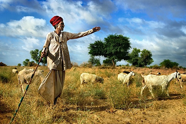
The above photograph is in large part about that attention-grabbing red. It helps me to immediately bring attention to what I considered to be the most important element to the story in this image, the turban. This turban is representative of the cultural background of the shepherd, it says that he is a man of tradition and this is something that I wanted to really highlight.
The red also leads the way in communicating how this scene felt while I was shooting it -dynamic, exciting. This is also in large part due to the overall palette, which in addition to the red is made up of other bright, vivid colors that are usually considered dynamic, lively, exciting.
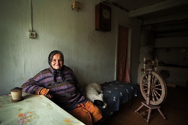
The dominant color palette in this image is fairly subdued and neutral. The mood that it creates leans towards being melancholic, but the rather subtle “splashes” of brighter colors inject a little life and excitement into the scene (without completely shifting the feel of it). I think that this is fitting, as the mood in that room was a little melancholic and somewhat lively at once.
Against the mostly subdued, neutral palette that dominates the frame those “splashes” of color inevitably demand our attention. It is as if the photograph is saying quietly, but clearly “Look here and now look there, these details are also important to the story”. Color (along with composition) helps our eye progress from the brightest, most vivid element, the central character – the woman, to all the other, less noticeable elements that add a certain level depth to the story.

Here we’ve got bright, fairly vivid colors. Again there’s a sense of excitement, energy, perhaps an association with happy times, due to the blue sky and the brightness of everything, especially when you connect the color to the subject matter – parent and child.
The dark flesh tones really stand out against that bright blue sky, hence the presence of the father and the son is strongly felt. It’s clear that they are the central characters of the story. At the same time, the surroundings, which are also important components of the story are not completely overshadowed either, because they are so bright and vivid, their presence is strongly felt too.
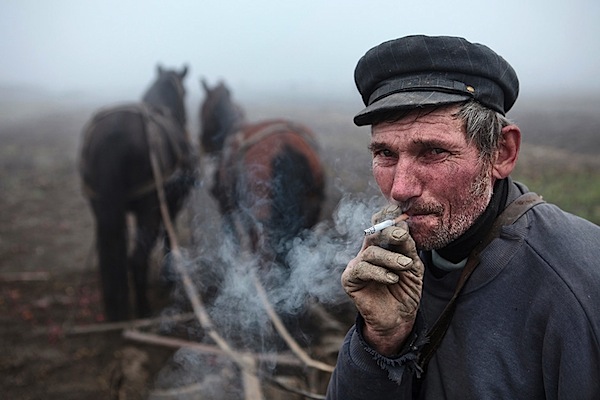
Here the colors are equally important to the mood and to the story. The subdued, earthy palette dominated by shades of grey creates a mood which is fairly sombre and that’s exactly how the scene felt. The palette is also reflective of this man’s story, his tough job of ploughing the land during a grey, foggy autumn (fall) day.
It should be noted that the absence of certain colors can be just as important to creating a mood and telling a story as their presence, and here, the absence of bright, vivid colors ensures that the somberness is communicated strongly and that the story of hard-living is clear as can be.
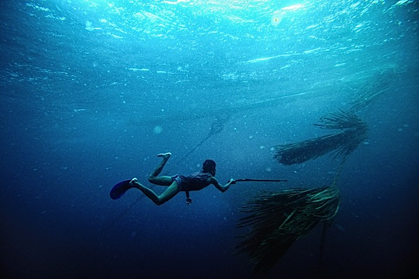
This image is essentially duo-tone. The simple minimal palette allowed me to emphasize the “gestures”, which are where the story is, the hand with the spear-gun pointing towards the palm leaves underwater (that’s what those things are), the legs in swimming motion. Less colors has equalled in no distractions from what’s important.
One could argue that this image would work just as well in black and white, but I feel that the blue of the water plays a strong role in speaking to the senses, it helps communicate what it’s like to be in the sea, the coolness, the powerful presence of it. Towards the bottom part of the frame, as the water becomes dark blue, things get a little mysterious, darkness (dark colors) is often associated with the unknown. This sense of mystery is what you feel in the deeper part of the sea and it’s something that I really wanted to convey through the photograph too.

Vibrant shades of green and the warm, yellow-orange tinge created by the morning sun dominate this image.
This palette is inevitably evocative of vitality and generally positive emotions.
The story in this photograph is quite simple, it’s about the beauty of the landscape, the energy and excitement of the morning and it is only through the palette dominated by those vibrant, warm colors that it can be communicated effectively.
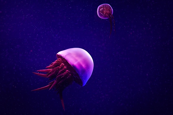
Sometimes the color of a particular scene we see captures our imagination, gets us excited and compels us to make the photograph. Even if we aren’t aware of it, it speaks to our senses. The above image is one such example. Color lends it a somewhat surreal and mystical quality, it creates a very distinct feel. In such photographs, color and the sensory response it evokes are so important that any kind of story can in a sense become secondary. Color is what makes (or breaks) these kinds of images and without it they (the images) simply do not work.
Well, that’s all for this post. I hope that by taking a closer look at these examples of what role color can play in photography you are now a little more aware of its importance and potential. I urge those of you who make color photographs to begin taking advantage of color during your next shoot. Start thinking how you can use color to tell your own stories and to communicate the emotions, sensations or moods that you want the viewers of your photographs to feel.
No comments:
Post a Comment