Minimalism: Using Negative Space In Your Photographs
Sometimes it’s nice and refreshing to just strip a photo or scene down to it’s absolute bare essentials. Often times, I get too caught up in trying to fill every part of the frame with something interesting. The problem is, sometimes when we try to fill up the entire frame with objects, lines, people, shapes, etc, we actually overcomplicate things and leave the viewer wanting a place to rest their eyes.
The trick/secret is this: Negative space can be just as interesting in a photograph as anything else, if done right.
I encourage you to consider this the next time you go out shooting. Incorporating negative space into your images can be very rewarding, and at the same time quite challenging. Sometimes situations will present themselves where it’s clear. Other times you will have to get creative with a subject to find the proper framing to create this type of image. Here are a few examples of negative space and minimalism to get your creative juices flowing…
In the above image, Brian Matiash actually set out to create a series of minimalistic, black and white images around Staten Island. This is just one image from that series. This is also a great example of successfully breaking the “rule” of photography about not placing your horizons in the center. Sometimes the composition of the image and the leading lines within the frame demand it. I believe that if Brian had composed the scene with less sky and more water, the reflections of the old pier would be complete in the scene, and he would lose that anchor to the bottom of the frame. On the flip side, if he had composed with more sky and less water, the image would lose interest by cutting out key parts of the reflection
.
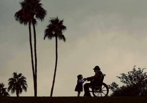
I love this image by Mike Olbinski. It’s from a photo shoot he did for a family back in December (here’s a link to the post). The post Mike wrote speaks to the importance of getting family portraits done and getting them done now. Just months after this photo shoot was completed, the great grandfather in this image passed away. While the loss of a loved one is always a time of mourning, it’s really great to know the little girl in this image will now forever have this beautiful image of her and her great grandfather. The simplicity and minimalism in the image is incredible. The light on the subjects is just enough to provide definition to the girl and the palm trees in the background frame the shot beautifully. Great image Mike.


No comments:
Post a Comment